

WORK

Full case study ~5 min read

B2C

Advocacy & eCommerce

Website

Improved task completion by 52% by aligning global navigation with user journeys

Redesigned Consumer Reports global navigation and taxonomy to clarify user pathways and surface CR’s broader portfolio.

View Live

Year2025

Freelance

40 hrs a week, 2 months

Methodologies

User Centered DesignUser FlowsUX & UI DesignPrototypingUsability Testing & Tree TestingUX WritingTaxonomyAI-Assisted Research & Usability TestingAI-Thought Partner

Tools & Frameworks

Figma & FigJamAnthropic ClaudeChatGTP

Jira & Confluence

Usertesting.com

Google Slides

Context

Consumer Reports serves millions of users across product reviews, ratings, advocacy, savings tools, and membership benefits—but the site's navigation hadn't kept pace with the breadth of what it offers. A prior engagement with AKQA had validated the hamburger menu as a preferred pattern, but the work stopped short of solving deeper structural and discoverability issues. I picked up where that effort left off—pressure-testing the structure, designing new variants, and running the research needed to move from exploration to a recommendation.

I partnered with a Head of Product & Design, UX Director, and Associate Product Director to move deeper into design exploration, through unmoderated usability testing to a final stakeholder recommendation with a phased rollout plan.

Role: Senior Product Designer

Scope: Led UX strategy and design for a full redesign of Consumer Reports’ sitewide navigation, improving how users discover and engage with content and tools. This initiative also introduced a new strategic design approach within the organization.

Work included competitive benchmarking, designing and testing 3 navigation variants through an unmoderated usability study with 75 participants, and synthesizing research into actionable recommendations that drove stakeholder buy-in for a hybrid "Search & Browse" approach.

Problem

CR's navigation was organized around internal taxonomy rather than how users actually think and search—creating a gap between what CR offers and what users could actually find.

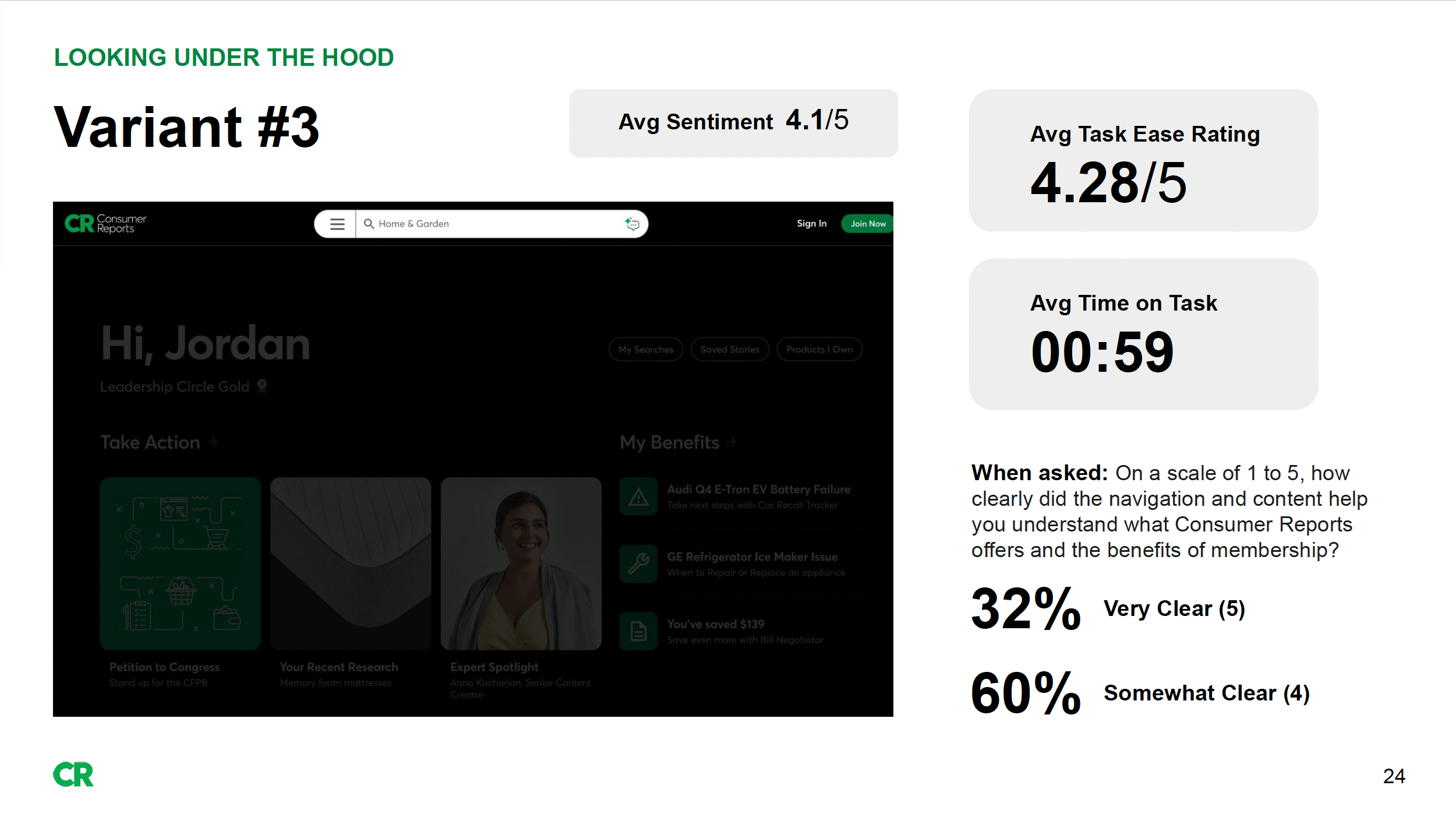
Usability testing with 75 participants across 3 variants revealed:

INSIGHT: Product tasks were easy; abstract tasks were not. Users found tires, vacuums, and car seats with ease but consistently struggled to locate insurance, "Best Time to Buy," and savings tools.

IMPACT: CR's highest-value differentiators—insurance guidance, "Best Time to Buy," savings tools—are the exact content users can't find. The features that would convert a casual visitor into a paying member are functionally invisible through navigation.

INSIGHT: Labels didn't match mental models. Categories like "Life & Money," "Impact," and "Home & Garden" forced users to guess where content lived.

IMPACT: Every wrong guess is a moment of doubt. When users can't predict where content lives, they lose trust in the system—and by extension, in CR's ability to organize the expertise they're paying for.

INSIGHT: No cross-listing for cross-category content. Pet vacuums, car insurance, and car seats logically belong in multiple places but were siloed under single categories, creating dead ends.

IMPACT: Dead ends don't just slow users down—they tell users the content doesn't exist. Someone looking for car insurance under "Cars" who doesn't find it may never think to check "Life & Money." That's not a missed click, it's missed revenue and a diminished perception of what CR offers.

INSIGHT: Information overload for new users. The current nav communicated CR's breadth but at the cost of a steep learning curve—even for long-time members.

IMPACT: The moment a new visitor feels overwhelmed is the moment they leave. CR's breadth is a competitive advantage, but only if users can absorb it. A steep learning curve at the front door means the users who need the most convincing—non-members—are the ones most likely to bounce.

INSIGHT: Search was a crutch, not a complement. Users defaulted to the search bar when navigation failed, signaling structural gaps rather than user preference.

IMPACT: When search is the only reliable path, navigation becomes decorative. That means users only find what they already know to look for—eliminating the organic discovery ("I didn't know CR covered that") that drives membership conversion and long-term engagement.

Opportunity

1

When navigation reflects how a company is organized rather than how users think, every interaction becomes a guessing game—and every wrong guess has a cost.

2

When search is the only reliable path, users only find what they already know to look for—and CR loses the discovery engine that expands perception and drives deeper engagement.

3

The features that differentiate CR from every other review site are the ones users are least likely to find—which means CR is competing on product reviews alone when it doesn't have to.

4

Usability that improves with repetition isn't usability—it's a learning curve CR can't afford, especially for the non-members it's trying to convert.

If we redesign the global navigation to prioritize how users think over how CR is organized, we believe:

  • Findability improves when content lives where users expect it—not just where taxonomy puts it. Cross-listing and polyhierarchy will eliminate dead ends and reduce reliance on search as a fallback.
  • Perceived value increases when high-differentiating content like "Best Time to Buy," insurance, and savings tools is surfaced earlier in the experience—not buried behind abstract labels users have to figure out.
  • CR feels as big as it actually is when category depth is consistent and tools are surfaced by product context—"Tools for Cars," "Tools for Home"—rather than hidden inside menu hierarchies users have to dig through.
  • Cognitive load decreases when users have multiple navigation paths that match their intent—browse, scan, or search—rather than being funneled through a single structure that assumes one way of thinking. Search should be elevated as a first-class path alongside browsing, not treated as a fallback.
  • First-attempt success replaces learned behavior when the system does the work instead of the user—through clearer labeling, flatter structures, and familiar affordance patterns that remove hesitation before it starts.
  • New users convert faster when onboarding cues like tooltips, progressive disclosure, and highlighted sections meet them where they are— educing the learning curve at the exact moment their patience is lowest.

Goals

Primary Goals

    • Improve content discoverability so users can find what they need through navigation.
    • Expand perceived value of CR membership by surfacing differentiating content like insurance, "Best Time to Buy," and savings tools earlier and more prominently in the experience.
    • Reduce cognitive load by aligning navigation labels, structure, and depth with how users actually think and search rather than how CR is organized internally.

Supporting Goals

    • Support multiple navigation styles by offering parallel pathways—browse, scan, and search—that accommodate diverse user mental models without creating redundancy or confusion.
    • Eliminate dead ends by introducing cross-linking and polyhierarchy so content that belongs in multiple categories is findable from multiple entry points.
    • Reduce the learning curve for new users by introducing onboarding cues and progressive disclosure that orient first-time visitors without adding permanent clutter for returning members.
    • Ensure navigation communicates CR's full breadth through consistent category depth and clearer labeling—so the experience feels as robust as the offering actually is.

Research

What I DidI designed and executed an end-to-end unmoderated usability study to evaluate three navigation variants—the current CR menu, an iterated hamburger menu, and a new search-and-browse approach—building on prior research from AKQA that had validated the hamburger pattern. I leveraged AI tools (Claude and ChatGPT) to accelerate test planning, UX writing for task scenarios, and synthesis of participant data across 75 sessions—enabling faster pattern recognition and sharper insight extraction at scale.Who I Did It With

75 participants across 3 variants (25 per variant) recruited through UserTesting.com. Participants were men and women ages 25–70, balanced across demographics and US regions, including both CR members and non-members. All were actively researching at least one product category—vacuums, car insurance, used cars, or baby products.

What I MeasuredTask efficiency, cognitive effort, perceived CR value, ease of navigation, and content discoverability—tested across 6 tasks ranging from straightforward product lookups (tires, vacuums, car seats) to broader, more abstract content (insurance, "Best Time to Buy," used cars).
See Read Out

Key Findings

  • Product tasks succeeded everywhere. Tires, vacuums, car seats, and used cars were easy to find regardless of variant. The taxonomy works when content maps cleanly to a single category.

64-76% of users found care seats “very easy" to find but debated whether they belong under Cars or Baby—revealing a cross-category gap.

  • Abstract tasks failed everywhere. Insurance was the hardest task across all three variants—users couldn't find it, didn't know where to look, and frequently gave up without search. "Best Time to Buy" was similarly problematic.

12% of users found insurance “very easy” to find. Users consistently expected insurance to live within its related product category—e.g., car insurance under Cars, home insurance under Home & Garden—rather than as a standalone, abstract category.

  • Product tasks succeeded everywhere. Tires, vacuums, car seats, and used cars were easy to find regardless of variant. The taxonomy works when content maps cleanly to a single category.
  • Abstract tasks failed everywhere. Insurance was the hardest task across all three variants—users couldn't find it, didn't know where to look, and frequently gave up without search. "Best Time to Buy" was similarly problematic.
  • Search dominated as the preferred path. Nearly all participants favored the search bar for speed and efficiency, particularly for complex or cross-category content. This held true across all variants.
  • Discovery drove delight—when it happened. Users who stumbled onto unexpected content ("I didn't know CR covered that") had the strongest positive reactions. But discovery was incidental, not designed.
  • Users adapted to the system; the system didn't guide them. Confidence and efficiency improved with repetition across Variants #2 and #3—but because users learned workarounds, not because the design facilitated first-attempt success.
  • Multiple pathways were valued, not confusing. Users in Variant #2 specifically praised having more than one way in. Redundancy felt like flexibility, not clutter.

Solution

View Live

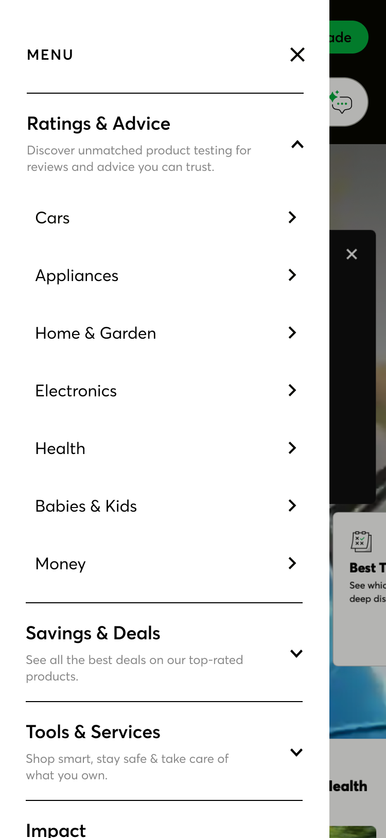
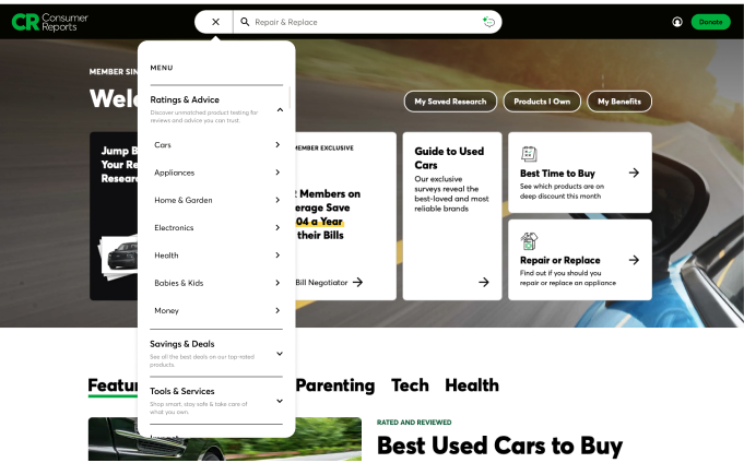
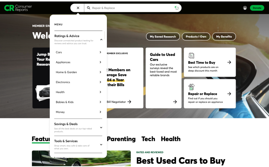
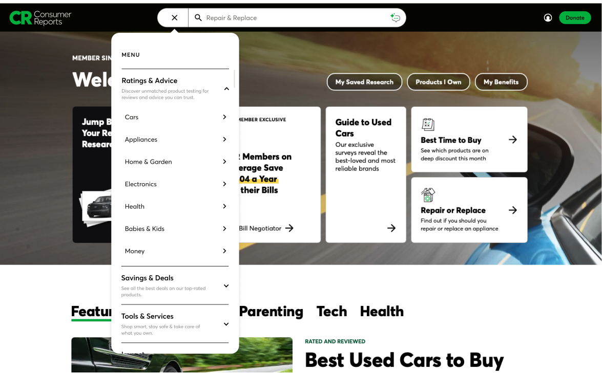
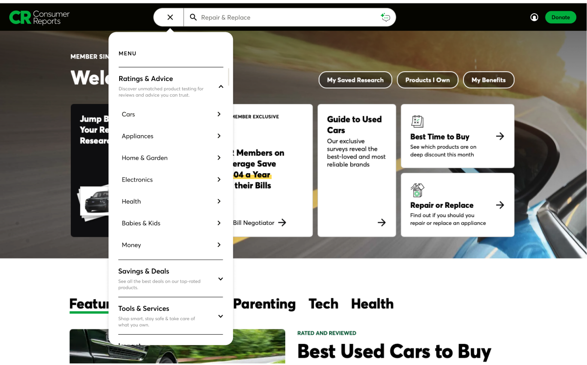
Search & Browse was the winner: 88% of users said it was “very easy”

    • Retained the left-hand vertical hamburger menu for its scannability, structure, and ability to surface unexpected content.
    • Kept Level 1 categories in the masthead to preserve multi-path flexibility and accommodate different browsing styles.
    • Elevated search with an expanded search bar in the masthead recognizing it as users' preferred navigation method—making it a first-class path alongside browsing, not a fallback.

Strategic Recommendations

    • Introduce polyhierarchy and cross-linking so content is findable from multiple entry points
    • Revise ambiguous labels ("Life & Money," "Impact," "Home & Garden") to match user language
    • Surface tools by product context rather than burying them in menus
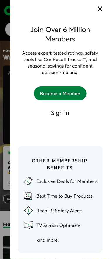
    • Add onboarding cues like tooltips, walkthroughs, and highlighted sections for first-time users
    • Ensure consistent category depth so the navigation reflects CR's full breadth

Phased rollout plan

Partnered with Product and Taxonomy to define a phased implementation prioritizing quick wins (labeling, cross-links) alongside longer-term structural changes (polyhierarchy).

Outcomes

User satisfaction increased by 10.5%

Users completed tasks 52% faster

Ease of use improved by 5.2%

BACK

All work designed with love (and many sticky notes) by © Bridget Lyons, Studio b Creative Co. LLC 2026. All rights reserved.

WORK

Full case study ~5 min read

B2C

Advocacy & eCommerce

Website

Improved task completion by 52% by aligning global navigation with user journeys

Redesigned Consumer Reports global navigation and taxonomy to clarify user pathways and surface CR’s broader portfolio.

View Live

Year2025

Freelance

40 hrs a week, 2 months

Methodologies

User Centered DesignUser FlowsUX & UI DesignPrototypingUsability Testing & Tree TestingUX WritingTaxonomyAI-Assisted Research & Usability TestingAI-Thought Partner

Tools & Frameworks

Figma & FigJamAnthropic ClaudeChatGTP

Jira & Confluence

Usertesting.com

Google Slides

Context

Consumer Reports serves millions of users across product reviews, ratings, advocacy, savings tools, and membership benefits—but the site's navigation hadn't kept pace with the breadth of what it offers. A prior engagement with AKQA had validated the hamburger menu as a preferred pattern, but the work stopped short of solving deeper structural and discoverability issues. I picked up where that effort left off—pressure-testing the structure, designing new variants, and running the research needed to move from exploration to a recommendation.

I partnered with a Head of Product & Design, UX Director, and Associate Product Director to move deeper into design exploration, through unmoderated usability testing to a final stakeholder recommendation with a phased rollout plan.

Role: Senior Product Designer

Scope: Led UX strategy and design for a full redesign of Consumer Reports’ sitewide navigation, improving how users discover and engage with content and tools. This initiative also introduced a new strategic design approach within the organization.

Work included competitive benchmarking, designing and testing 3 navigation variants through an unmoderated usability study with 75 participants, and synthesizing research into actionable recommendations that drove stakeholder buy-in for a hybrid "Search & Browse" approach.

Problem

CR's navigation was organized around internal taxonomy rather than how users actually think and search—creating a gap between what CR offers and what users could actually find.

Usability testing with 75 participants across 3 variants revealed:

INSIGHT: Product tasks were easy; abstract tasks were not. Users found tires, vacuums, and car seats with ease but consistently struggled to locate insurance, "Best Time to Buy," and savings tools.

IMPACT: CR's highest-value differentiators—insurance guidance, "Best Time to Buy," savings tools—are the exact content users can't find. The features that would convert a casual visitor into a paying member are functionally invisible through navigation.

INSIGHT: Labels didn't match mental models. Categories like "Life & Money," "Impact," and "Home & Garden" forced users to guess where content lived.

IMPACT: Every wrong guess is a moment of doubt. When users can't predict where content lives, they lose trust in the system—and by extension, in CR's ability to organize the expertise they're paying for.

INSIGHT: No cross-listing for cross-category content. Pet vacuums, car insurance, and car seats logically belong in multiple places but were siloed under single categories, creating dead ends.

IMPACT: Dead ends don't just slow users down—they tell users the content doesn't exist. Someone looking for car insurance under "Cars" who doesn't find it may never think to check "Life & Money." That's not a missed click, it's missed revenue and a diminished perception of what CR offers.

INSIGHT: Information overload for new users. The current nav communicated CR's breadth but at the cost of a steep learning curve—even for long-time members.

IMPACT: The moment a new visitor feels overwhelmed is the moment they leave. CR's breadth is a competitive advantage, but only if users can absorb it. A steep learning curve at the front door means the users who need the most convincing—non-members—are the ones most likely to bounce.

INSIGHT: Search was a crutch, not a complement. Users defaulted to the search bar when navigation failed, signaling structural gaps rather than user preference.

IMPACT: When search is the only reliable path, navigation becomes decorative. That means users only find what they already know to look for—eliminating the organic discovery ("I didn't know CR covered that") that drives membership conversion and long-term engagement.

Opportunity

1

When navigation reflects how a company is organized rather than how users think, every interaction becomes a guessing game—and every wrong guess has a cost.

2

When search is the only reliable path, users only find what they already know to look for—and CR loses the discovery engine that expands perception and drives deeper engagement.

3

The features that differentiate CR from every other review site are the ones users are least likely to find—which means CR is competing on product reviews alone when it doesn't have to.

4

Usability that improves with repetition isn't usability—it's a learning curve CR can't afford, especially for the non-members it's trying to convert.

If we redesign the global navigation to prioritize how users think over how CR is organized, we believe:

  • Findability improves when content lives where users expect it—not just where taxonomy puts it. Cross-listing and polyhierarchy will eliminate dead ends and reduce reliance on search as a fallback.
  • Perceived value increases when high-differentiating content like "Best Time to Buy," insurance, and savings tools is surfaced earlier in the experience—not buried behind abstract labels users have to figure out.
  • CR feels as big as it actually is when category depth is consistent and tools are surfaced by product context—"Tools for Cars," "Tools for Home"—rather than hidden inside menu hierarchies users have to dig through.
  • Cognitive load decreases when users have multiple navigation paths that match their intent—browse, scan, or search—rather than being funneled through a single structure that assumes one way of thinking. Search should be elevated as a first-class path alongside browsing, not treated as a fallback.
  • First-attempt success replaces learned behavior when the system does the work instead of the user—through clearer labeling, flatter structures, and familiar affordance patterns that remove hesitation before it starts.
  • New users convert faster when onboarding cues like tooltips, progressive disclosure, and highlighted sections meet them where they are— educing the learning curve at the exact moment their patience is lowest.

Goals

Primary Goals

    • Improve content discoverability so users can find what they need through navigation.
    • Expand perceived value of CR membership by surfacing differentiating content like insurance, "Best Time to Buy," and savings tools earlier and more prominently in the experience.
    • Reduce cognitive load by aligning navigation labels, structure, and depth with how users actually think and search rather than how CR is organized internally.

Supporting Goals

    • Support multiple navigation styles by offering parallel pathways—browse, scan, and search—that accommodate diverse user mental models without creating redundancy or confusion.
    • Eliminate dead ends by introducing cross-linking and polyhierarchy so content that belongs in multiple categories is findable from multiple entry points.
    • Reduce the learning curve for new users by introducing onboarding cues and progressive disclosure that orient first-time visitors without adding permanent clutter for returning members.
    • Ensure navigation communicates CR's full breadth through consistent category depth and clearer labeling—so the experience feels as robust as the offering actually is.

Research

What I DidI designed and executed an end-to-end unmoderated usability study to evaluate three navigation variants—the current CR menu, an iterated hamburger menu, and a new search-and-browse approach—building on prior research from AKQA that had validated the hamburger pattern. I leveraged AI tools (Claude and ChatGPT) to accelerate test planning, UX writing for task scenarios, and synthesis of participant data across 75 sessions—enabling faster pattern recognition and sharper insight extraction at scale.Who I Did It With

75 participants across 3 variants (25 per variant) recruited through UserTesting.com. Participants were men and women ages 25–70, balanced across demographics and US regions, including both CR members and non-members. All were actively researching at least one product category—vacuums, car insurance, used cars, or baby products.

What I MeasuredTask efficiency, cognitive effort, perceived CR value, ease of navigation, and content discoverability—tested across 6 tasks ranging from straightforward product lookups (tires, vacuums, car seats) to broader, more abstract content (insurance, "Best Time to Buy," used cars).

See Read Out

Key Findings

  • Product tasks succeeded everywhere. Tires, vacuums, car seats, and used cars were easy to find regardless of variant. The taxonomy works when content maps cleanly to a single category.

64-76% of users found care seats “very easy" to find but debated whether they belong under Cars or Baby—revealing a cross-category gap.

  • Abstract tasks failed everywhere. Insurance was the hardest task across all three variants—users couldn't find it, didn't know where to look, and frequently gave up without search. "Best Time to Buy" was similarly problematic.

12% of users found insurance “very easy” to find. Users consistently expected insurance to live within its related product category—e.g., car insurance under Cars, home insurance under Home & Garden—rather than as a standalone, abstract category.

  • Product tasks succeeded everywhere. Tires, vacuums, car seats, and used cars were easy to find regardless of variant. The taxonomy works when content maps cleanly to a single category.
  • Abstract tasks failed everywhere. Insurance was the hardest task across all three variants—users couldn't find it, didn't know where to look, and frequently gave up without search. "Best Time to Buy" was similarly problematic.
  • Search dominated as the preferred path. Nearly all participants favored the search bar for speed and efficiency, particularly for complex or cross-category content. This held true across all variants.
  • Discovery drove delight—when it happened. Users who stumbled onto unexpected content ("I didn't know CR covered that") had the strongest positive reactions. But discovery was incidental, not designed.
  • Users adapted to the system; the system didn't guide them. Confidence and efficiency improved with repetition across Variants #2 and #3—but because users learned workarounds, not because the design facilitated first-attempt success.
  • Multiple pathways were valued, not confusing. Users in Variant #2 specifically praised having more than one way in. Redundancy felt like flexibility, not clutter.

Solution

View Live

Search & Browse was the winner: 88% of users said it was “very easy”

    • Retained the left-hand vertical hamburger menu for its scannability, structure, and ability to surface unexpected content.
    • Kept Level 1 categories in the masthead to preserve multi-path flexibility and accommodate different browsing styles.
    • Elevated search with an expanded search bar in the masthead recognizing it as users' preferred navigation method—making it a first-class path alongside browsing, not a fallback.

Strategic Recommendations

    • Introduce polyhierarchy and cross-linking so content is findable from multiple entry points
    • Revise ambiguous labels ("Life & Money," "Impact," "Home & Garden") to match user language
    • Surface tools by product context rather than burying them in menus
    • Add onboarding cues like tooltips, walkthroughs, and highlighted sections for first-time users
    • Ensure consistent category depth so the navigation reflects CR's full breadth

Phased rollout plan

Partnered with Product and Taxonomy to define a phased implementation prioritizing quick wins (labeling, cross-links) alongside longer-term structural changes (polyhierarchy).

Outcomes

User satisfaction increased by 10.5%

Users completed tasks 52% faster

Ease of use improved by 5.2%

BACK

About

Resume

All work designed with love (and many sticky notes) by © Bridget Lyons, Studio b Creative Co. LLC 2026. All rights reserved.

WORK

Full case study ~5 min read

B2C

Advocacy & eCommerce

Website

Improved task completion by 52% by aligning global navigation with user journeys

Redesigned Consumer Reports global navigation and taxonomy to clarify user pathways and surface CR’s broader portfolio.

View Live

Year2025

Freelance

40 hrs a week, 2 months

Methodologies

User Centered DesignUser FlowsUX & UI DesignPrototypingUsability Testing & Tree TestingUX WritingTaxonomyAI-Assisted Research & Usability TestingAI-Thought Partner

Tools & Frameworks

Figma & FigJamAnthropic ClaudeChatGTP

Jira & Confluence

Usertesting.com

Google Slides

Context

Consumer Reports serves millions of users across product reviews, ratings, advocacy, savings tools, and membership benefits—but the site's navigation hadn't kept pace with the breadth of what it offers. A prior engagement with AKQA had validated the hamburger menu as a preferred pattern, but the work stopped short of solving deeper structural and discoverability issues. I picked up where that effort left off—pressure-testing the structure, designing new variants, and running the research needed to move from exploration to a recommendation.

I partnered with a Head of Product & Design, UX Director, and Associate Product Director to move deeper into design exploration, through unmoderated usability testing to a final stakeholder recommendation with a phased rollout plan.

Role: Senior Product Designer

Scope: Led UX strategy and design for a full redesign of Consumer Reports’ sitewide navigation, improving how users discover and engage with content and tools. This initiative also introduced a new strategic design approach within the organization.

Work included competitive benchmarking, designing and testing 3 navigation variants through an unmoderated usability study with 75 participants, and synthesizing research into actionable recommendations that drove stakeholder buy-in for a hybrid "Search & Browse" approach.

Problem

CR's navigation was organized around internal taxonomy rather than how users actually think and search—creating a gap between what CR offers and what users could actually find.

Usability testing with 75 participants across 3 variants revealed:

INSIGHT: Product tasks were easy; abstract tasks were not. Users found tires, vacuums, and car seats with ease but consistently struggled to locate insurance, "Best Time to Buy," and savings tools.

IMPACT: CR's highest-value differentiators—insurance guidance, "Best Time to Buy," savings tools—are the exact content users can't find. The features that would convert a casual visitor into a paying member are functionally invisible through navigation.

INSIGHT: Labels didn't match mental models. Categories like "Life & Money," "Impact," and "Home & Garden" forced users to guess where content lived.

IMPACT: Every wrong guess is a moment of doubt. When users can't predict where content lives, they lose trust in the system—and by extension, in CR's ability to organize the expertise they're paying for.

INSIGHT: No cross-listing for cross-category content. Pet vacuums, car insurance, and car seats logically belong in multiple places but were siloed under single categories, creating dead ends.

IMPACT: Dead ends don't just slow users down—they tell users the content doesn't exist. Someone looking for car insurance under "Cars" who doesn't find it may never think to check "Life & Money." That's not a missed click, it's missed revenue and a diminished perception of what CR offers.

INSIGHT: Information overload for new users. The current nav communicated CR's breadth but at the cost of a steep learning curve—even for long-time members.

IMPACT: The moment a new visitor feels overwhelmed is the moment they leave. CR's breadth is a competitive advantage, but only if users can absorb it. A steep learning curve at the front door means the users who need the most convincing—non-members—are the ones most likely to bounce.

INSIGHT: Search was a crutch, not a complement. Users defaulted to the search bar when navigation failed, signaling structural gaps rather than user preference.

IMPACT: When search is the only reliable path, navigation becomes decorative. That means users only find what they already know to look for—eliminating the organic discovery ("I didn't know CR covered that") that drives membership conversion and long-term engagement.

Opportunity

1

When navigation reflects how a company is organized rather than how users think, every interaction becomes a guessing game—and every wrong guess has a cost.

2

When search is the only reliable path, users only find what they already know to look for—and CR loses the discovery engine that expands perception and drives deeper engagement.

3

The features that differentiate CR from every other review site are the ones users are least likely to find—which means CR is competing on product reviews alone when it doesn't have to.

4

Usability that improves with repetition isn't usability—it's a learning curve CR can't afford, especially for the non-members it's trying to convert.

If we redesign the global navigation to prioritize how users think over how CR is organized, we believe:

  • Findability improves when content lives where users expect it—not just where taxonomy puts it. Cross-listing and polyhierarchy will eliminate dead ends and reduce reliance on search as a fallback.
  • Perceived value increases when high-differentiating content like "Best Time to Buy," insurance, and savings tools is surfaced earlier in the experience—not buried behind abstract labels users have to figure out.
  • CR feels as big as it actually is when category depth is consistent and tools are surfaced by product context—"Tools for Cars," "Tools for Home"—rather than hidden inside menu hierarchies users have to dig through.
  • Cognitive load decreases when users have multiple navigation paths that match their intent—browse, scan, or search—rather than being funneled through a single structure that assumes one way of thinking. Search should be elevated as a first-class path alongside browsing, not treated as a fallback.
  • First-attempt success replaces learned behavior when the system does the work instead of the user—through clearer labeling, flatter structures, and familiar affordance patterns that remove hesitation before it starts.
  • New users convert faster when onboarding cues like tooltips, progressive disclosure, and highlighted sections meet them where they are— educing the learning curve at the exact moment their patience is lowest.

Goals

Primary Goals

    • Improve content discoverability so users can find what they need through navigation.
    • Expand perceived value of CR membership by surfacing differentiating content like insurance, "Best Time to Buy," and savings tools earlier and more prominently in the experience.
    • Reduce cognitive load by aligning navigation labels, structure, and depth with how users actually think and search rather than how CR is organized internally.

Supporting Goals

    • Support multiple navigation styles by offering parallel pathways—browse, scan, and search—that accommodate diverse user mental models without creating redundancy or confusion.
    • Eliminate dead ends by introducing cross-linking and polyhierarchy so content that belongs in multiple categories is findable from multiple entry points.
    • Reduce the learning curve for new users by introducing onboarding cues and progressive disclosure that orient first-time visitors without adding permanent clutter for returning members.
    • Ensure navigation communicates CR's full breadth through consistent category depth and clearer labeling—so the experience feels as robust as the offering actually is.

Research

What I DidI designed and executed an end-to-end unmoderated usability study to evaluate three navigation variants—the current CR menu, an iterated hamburger menu, and a new search-and-browse approach—building on prior research from AKQA that had validated the hamburger pattern. I leveraged AI tools (Claude and ChatGPT) to accelerate test planning, UX writing for task scenarios, and synthesis of participant data across 75 sessions—enabling faster pattern recognition and sharper insight extraction at scale.Who I Did It With

75 participants across 3 variants (25 per variant) recruited through UserTesting.com. Participants were men and women ages 25–70, balanced across demographics and US regions, including both CR members and non-members. All were actively researching at least one product category—vacuums, car insurance, used cars, or baby products.

What I MeasuredTask efficiency, cognitive effort, perceived CR value, ease of navigation, and content discoverability—tested across 6 tasks ranging from straightforward product lookups (tires, vacuums, car seats) to broader, more abstract content (insurance, "Best Time to Buy," used cars).

See Read Out

Key Findings

  • Product tasks succeeded everywhere. Tires, vacuums, car seats, and used cars were easy to find regardless of variant. The taxonomy works when content maps cleanly to a single category.

64-76% of users found care seats “very easy" to find but debated whether they belong under Cars or Baby—revealing a cross-category gap.

  • Abstract tasks failed everywhere. Insurance was the hardest task across all three variants—users couldn't find it, didn't know where to look, and frequently gave up without search. "Best Time to Buy" was similarly problematic.

12% of users found insurance “very easy” to find. Users consistently expected insurance to live within its related product category—e.g., car insurance under Cars, home insurance under Home & Garden—rather than as a standalone, abstract category.

  • Product tasks succeeded everywhere. Tires, vacuums, car seats, and used cars were easy to find regardless of variant. The taxonomy works when content maps cleanly to a single category.
  • Abstract tasks failed everywhere. Insurance was the hardest task across all three variants—users couldn't find it, didn't know where to look, and frequently gave up without search. "Best Time to Buy" was similarly problematic.
  • Search dominated as the preferred path. Nearly all participants favored the search bar for speed and efficiency, particularly for complex or cross-category content. This held true across all variants.
  • Discovery drove delight—when it happened. Users who stumbled onto unexpected content ("I didn't know CR covered that") had the strongest positive reactions. But discovery was incidental, not designed.
  • Users adapted to the system; the system didn't guide them. Confidence and efficiency improved with repetition across Variants #2 and #3—but because users learned workarounds, not because the design facilitated first-attempt success.
  • Multiple pathways were valued, not confusing. Users in Variant #2 specifically praised having more than one way in. Redundancy felt like flexibility, not clutter.

Solution
View Live

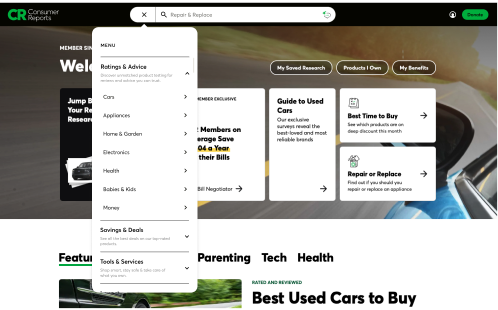
Search & Browse was the winner: 88% of users said it was “very easy”

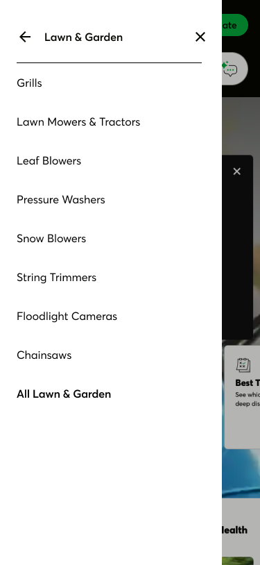
    • Retained the left-hand vertical hamburger menu for its scannability, structure, and ability to surface unexpected content.
    • Kept Level 1 categories in the masthead to preserve multi-path flexibility and accommodate different browsing styles.
    • Elevated search with an expanded search bar in the masthead recognizing it as users' preferred navigation method—making it a first-class path alongside browsing, not a fallback.

Strategic Recommendations

    • Introduce polyhierarchy and cross-linking so content is findable from multiple entry points
    • Revise ambiguous labels ("Life & Money," "Impact," "Home & Garden") to match user language
    • Surface tools by product context rather than burying them in menus
    • Add onboarding cues like tooltips, walkthroughs, and highlighted sections for first-time users
    • Ensure consistent category depth so the navigation reflects CR's full breadth

Phased rollout plan

Partnered with Product and Taxonomy to define a phased implementation prioritizing quick wins (labeling, cross-links) alongside longer-term structural changes (polyhierarchy).

Outcomes

User satisfaction increased by 10.5%

Users completed tasks 52% faster

Ease of use improved by 5.2%
BACK

About

Resume