
Good morning, Dr. Patel

Your practice, at a glance.

Jump back into where you left off, or explore a new area of the platform.

Patients

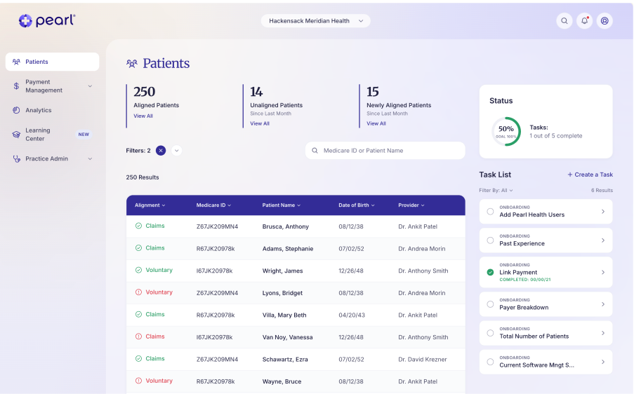
250 aligned · 14 unaligned

Payment Management

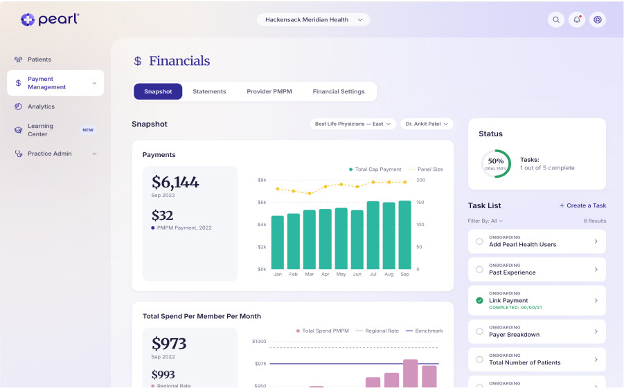
Sep payment · $6,144

Task List

5

1 of 5 complete

Analytics

$150k savings forecast

Learning Center

New

3 new items

Practice Admin

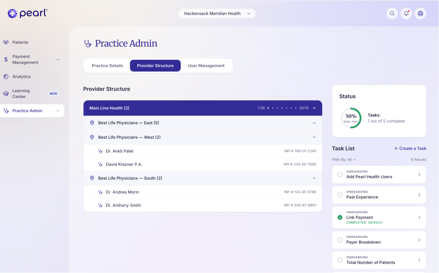
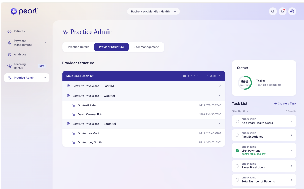
Provider & user setup

© 2026 Pearl Health

Terms of Service

Privacy Policy

Hackensack Meridian Health

Full case study ~8 min read

B2B

Health Tech

Web App

Reducing patient risk identification time by 60% for primary care providers

Designed and launched MVP for a new health tech platform, defining core UX, care journeys, and product architecture from the ground up.

Link to Prototype

ClientPearl Health

Year2025

Fill-Time

6 months

Methodologies

User Centered DesignUser FlowsUX & UI DesignPrototyping

Requirements Gathering & ValidationUsability Testing & Card SortingUX Writing

Tools & Frameworks

Loveable: Vibe CodeJira & Confluence

Google Slides

Context

Pearl Health is a technology platform that supports primary care practices in value-based care programs, helping clinicians identify and surface high-risk patients, coordinate care more effectively, and improve health outcomes.

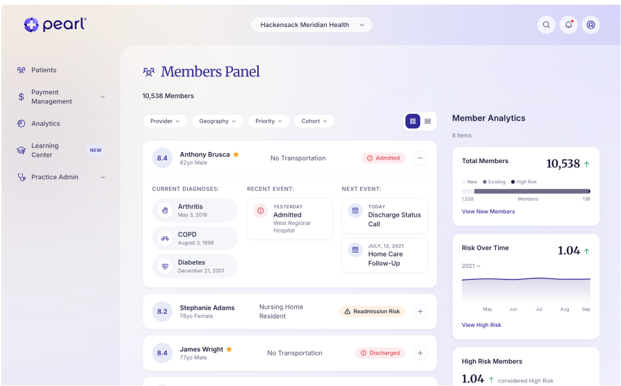
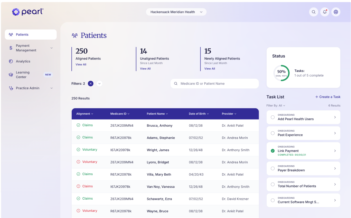
I led the 0→1 design and launch of an MVP dashboard, defining core product structure and translating complex healthcare data into clear, actionable experiences.

Role: Lead UX Designer

Scope: I led the design of the MVP from early requirements through to launch, working closely with primary care physicians to define and validate core workflows. Throughout the process, we translated initial product requirements into functional design concepts, continuously testing and refining the platform based on physician feedback and usability insights to ensure it supported real-world clinical needs.

Problem

Primary care physicians play a critical role in improving patient outcomes and reducing healthcare costs, particularly within value-based care models. However, those participating in Direct Contracting lacked a clear, trustworthy way to understand their patient populations or track financial and clinical performance. Existing tools surfaced large volumes of fragmented and often unreliable data without prioritization or context, forcing providers to spend valuable time searching for critical insights instead of focusing on patient care.

This gap left physicians operating reactively rather than proactively, limiting their ability to identify high-risk patients, coordinate care effectively, and fully realize the benefits of value-based care—both for patient outcomes and practice revenue.

Pearl Health was founded to address this challenge by empowering primary care providers with the tools and insights needed to deliver better care and succeed under value-based payment models.

Key pain points:

Every single participant had to rely on Medicare directly just to view their own patient lists—there was no consolidated view

EHRs were missing critical Medicare payment details, creating friction in an already complex workflow

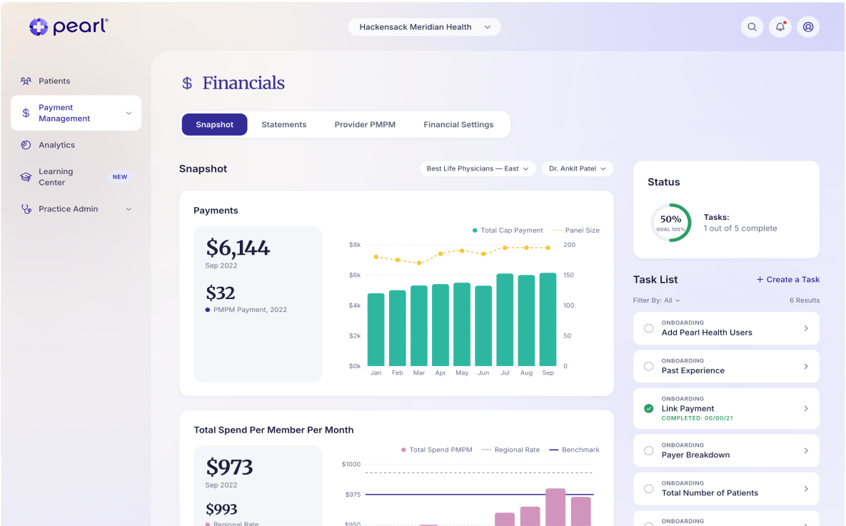
Most weren't familiar with capitation payments and were making decisions on blind assumptions

Difficult to identify which patients need immediate attention

Opportunity

The team believed that earlier onboarding would prepare providers for Direct Contracting before their patient data was even available—essentially, build readiness during the waiting period. That's the "why now" for the whole product.

The Desired Emotional Outcomes (great for framing the problem) For administrators: "I'm ready, I'm prepared. Things are easier using Pearl Health." For physicians: "Pearl will tell me what I need to know. When I use Pearl, my life gets better." These are worth including because they show the team was designing toward emotional trust, not just utility.

1

Smart prioritization

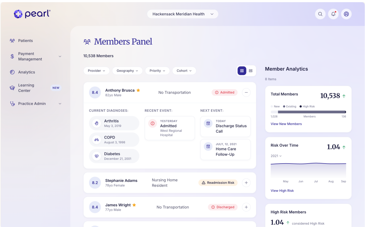
Implemented an intelligent risk scoring system that automatically surfaces patients requiring immediate attention, with clear visual indicators and explanations for each risk factor.

2

Streamlined navigation

Design the IA to reduce clicks and cognitive load, creating clear pathways for the most common tasks and workflows.

3

Data visualization

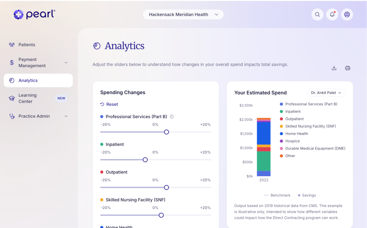
Use intuitive charts and graphs that make complex healthcare data easy to understand at a glance, with the ability to drill down for more details when needed.

4

Mobile-first design

Build a responsive interface that works seamlessly on tablets and phones, enabling providers to access critical information between patient visits.

Goals

    • Increase financial transparency into value-based care opportunities for primary care practices
    • Simplify understanding of participation options in programs
    • Reduce complexity in evaluating the financial implications of different care models
    • Help providers navigate limited time, bandwidth, and resources when assessing options
    • Enable more informed decision-making around adopting value-based care programs

Key Features

    • A dashboard that gives providers a clear view of their patient population at a glance
    • Tools that surface which patients need the most urgent attention
    • Clear visibility into how clinical work connects to financial performance
    • Deeper patient views for understanding context and next steps
    • A workflow built around how providers actually make decisions day to day
    • A way to go from raw data to clear, actionable next steps quickly
    • Designed to make value-based care easier to understand and act on

Research

What I DidI conducted 2 rounds of recorded moderated usability testing were conducted across a 4-month period (July–October 2021) in partnership with Pearl Health. Each round used a think-aloud protocol, asking participants to verbalize their reactions, thoughts, and opinions as they navigated key screens and completed defined tasks. Round 1 also incorporated a card sorting exercise to establish feature priority.Who I Did It With

Round 1 included 5 participants across 4 practices. Round 2 included 5 participants across 3 practices. Both rounds intentionally recruited a mix of small single-physician practices and larger multi-location medical conglomerates, including practices currently dissatisfied with existing tools and those with no solution at all. Roles represented included Practice Managers, Administrators, Physician Directors, Finance Administrators, and Data Analytics Managers.

What I MeasuredThe core goals across both rounds were to validate the MVP feature set, identify usability friction and areas of confusion, confirm discoverability of core functionality, assess the domain knowledge required to use the application, and gauge user trust and likelihood to adopt.


Key Findings

  • Navigation defaults to the menu, not the guide. Every participant abandoned the coach mark onboarding and navigated independently through the left-side menu—a unanimous signal that guided tooltips weren't earning attention or trust.

  • Registration requires outside help. All participants identified that completing registration would require pulling information from another system or another person entirely. Medicare payment IDs and related details are rarely surfaced in EHRs, creating a frustrating dead end during a critical first-use moment.

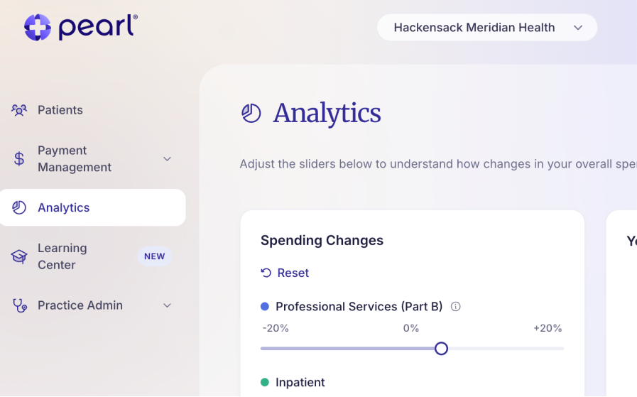
  • Insights are valued—but not obviously interactive. Participants responded enthusiastically to the actionable insights feature, yet none recognized the analytics sliders as interactive on first glance. The value was there; the affordance wasn't communicating it.

  • The Partners page is invisible. Not a single participant found their way to the Partners section when prompted. Without a recognizable label or clear entry point, the feature effectively didn't exist in the user's mental model.

  • Tasks resonate; audio is a bonus. 3 out of 5 participants found the tasks feature genuinely useful for managing their workload. Two out of five lit up at the idea of listening to audio recordings during their commute—a small but telling signal about how and when this audience consumes information.

  • Analytics are dense for non-clinical roles. Practice Managers found the analytics data highly valuable but struggled to scan it due to heavy acronym use. The information is right—the presentation needs to meet non-clinical users where they are.

  • Users want community-style benchmarking. Practice Managers weren't just looking for their own data—they wanted to know how they were performing relative to peers. A community or benchmarking layer would directly address this need and increase platform stickiness.

Guiding Principals

TransparentProvide visibility into other practice success and struggles AND provide visibility into other locations within their practice

FlexibleAllow users to select their own settings and permissions; ie display insights in % vs dollar amounts

SimpleKeep actions and the UI simple

HelpfulActions telling users how they can save and be successful

Goal Oriented

Add goal oriented opportunities in analytics and refine that section

Solution

The core design challenge was addressing providers' two biggest blockers—lack of analytics and limited bandwidth—while building enough trust and clarity that time-strapped physicians would actually act. Value-based care programs carry real financial risk, and providers needed to feel confident before committing. That meant designing a platform that could do three things at once: reduce cognitive load, increase financial legibility, and make value-based care feel understandable, transparent, and actionable.

Outcomes

Raised $75M Series B funding

60% reduction in time to identification at-risk patients

4.8/5 User satisfaction score

BACK

All work designed with love (and many sticky notes) by © Bridget Lyons, Studio b Creative Co. LLC 2026. All rights reserved.

Good morning, Dr. Patel

Your practice, at a glance.

Jump back into where you left off, or explore a new area of the platform.

Patients

250 aligned · 14 unaligned

Payment Management

Sep payment · $6,144

Task List

5

1 of 5 complete

Analytics

$150k savings forecast

Learning Center

New

3 new items

Practice Admin

Provider & user setup

© 2026 Pearl Health

Terms of Service

Privacy Policy

Hackensack Meridian Health

Full case study ~8 min read

B2B

Health Tech

Web App

Reducing patient risk identification time by 60% for primary care providers

Designed and launched MVP for a new health tech platform, defining core UX, care journeys, and product architecture from the ground up.

Link to Prototype

ClientPearl Health

Year2025

Fill-Time

6 months

Methodologies

User Centered DesignUser FlowsUX & UI DesignPrototyping

Requirements Gathering & ValidationUsability Testing & Card SortingUX Writing

Tools & Frameworks

Loveable: Vibe CodeJira & Confluence

Google Slides

Context

Pearl Health is a technology platform that supports primary care practices in value-based care programs, helping clinicians identify and surface high-risk patients, coordinate care more effectively, and improve health outcomes.

I led the 0→1 design and launch of an MVP dashboard, defining core product structure and translating complex healthcare data into clear, actionable experiences.

Role: Lead UX Designer

Scope: I led the design of the MVP from early requirements through to launch, working closely with primary care physicians to define and validate core workflows. Throughout the process, we translated initial product requirements into functional design concepts, continuously testing and refining the platform based on physician feedback and usability insights to ensure it supported real-world clinical needs.

Problem

Primary care physicians play a critical role in improving patient outcomes and reducing healthcare costs, particularly within value-based care models. However, those participating in Direct Contracting lacked a clear, trustworthy way to understand their patient populations or track financial and clinical performance. Existing tools surfaced large volumes of fragmented and often unreliable data without prioritization or context, forcing providers to spend valuable time searching for critical insights instead of focusing on patient care.

This gap left physicians operating reactively rather than proactively, limiting their ability to identify high-risk patients, coordinate care effectively, and fully realize the benefits of value-based care—both for patient outcomes and practice revenue.

Pearl Health was founded to address this challenge by empowering primary care providers with the tools and insights needed to deliver better care and succeed under value-based payment models.

Key pain points:

Every single participant had to rely on Medicare directly just to view their own patient lists—there was no consolidated view

EHRs were missing critical Medicare payment details, creating friction in an already complex workflow

Most weren't familiar with capitation payments and were making decisions on blind assumptions

Difficult to identify which patients need immediate attention

Opportunity

The team believed that earlier onboarding would prepare providers for Direct Contracting before their patient data was even available—essentially, build readiness during the waiting period. That's the "why now" for the whole product.

The Desired Emotional Outcomes (great for framing the problem) For administrators: "I'm ready, I'm prepared. Things are easier using Pearl Health." For physicians: "Pearl will tell me what I need to know. When I use Pearl, my life gets better." These are worth including because they show the team was designing toward emotional trust, not just utility.

1

Smart prioritization

Implemented an intelligent risk scoring system that automatically surfaces patients requiring immediate attention, with clear visual indicators and explanations for each risk factor.

2

Streamlined navigation

Design the IA to reduce clicks and cognitive load, creating clear pathways for the most common tasks and workflows.

3

Data visualization

Use intuitive charts and graphs that make complex healthcare data easy to understand at a glance, with the ability to drill down for more details when needed.

4

Mobile-first design

Build a responsive interface that works seamlessly on tablets and phones, enabling providers to access critical information between patient visits.

Goals

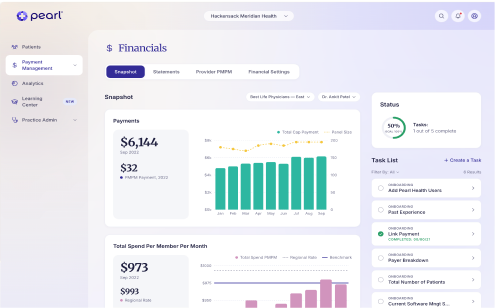
    • Increase financial transparency into value-based care opportunities for primary care practices
    • Simplify understanding of participation options in program
    • Reduce complexity in evaluating the financial implications of different care models
    • Help providers navigate limited time, bandwidth, and resources when assessing options
    • Enable more informed decision-making around adopting value-based care programs

Key Features

    • A dashboard that gives providers a clear view of their patient population at a glance
    • Tools that surface which patients need the most urgent attention
    • Clear visibility into how clinical work connects to financial performance
    • Deeper patient views for understanding context and next steps
    • A workflow built around how providers actually make decisions day to day
    • A way to go from raw data to clear, actionable next steps quickly
    • Designed to make value-based care easier to understand and act on

Research

What I DidI conducted 2 rounds of recorded moderated usability testing were conducted across a 4-month period (July–October 2021) in partnership with Pearl Health. Each round used a think-aloud protocol, asking participants to verbalize their reactions, thoughts, and opinions as they navigated key screens and completed defined tasks. Round 1 also incorporated a card sorting exercise to establish feature priority.Who I Did It With

Round 1 included 5 participants across 4 practices. Round 2 included 5 participants across 3 practices. Both rounds intentionally recruited a mix of small single-physician practices and larger multi-location medical conglomerates, including practices currently dissatisfied with existing tools and those with no solution at all. Roles represented included Practice Managers, Administrators, Physician Directors, Finance Administrators, and Data Analytics Managers.

What I MeasuredThe core goals across both rounds were to validate the MVP feature set, identify usability friction and areas of confusion, confirm discoverability of core functionality, assess the domain knowledge required to use the application, and gauge user trust and likelihood to adopt.
Key Findings

  • Navigation defaults to the menu, not the guide. Every participant abandoned the coach mark onboarding and navigated independently through the left-side menu—a unanimous signal that guided tooltips weren't earning attention or trust.

  • Registration requires outside help. All participants identified that completing registration would require pulling information from another system or another person entirely. Medicare payment IDs and related details are rarely surfaced in EHRs, creating a frustrating dead end during a critical first-use moment.

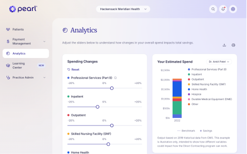
  • Insights are valued—but not obviously interactive. Participants responded enthusiastically to the actionable insights feature, yet none recognized the analytics sliders as interactive on first glance. The value was there; the affordance wasn't communicating it.

  • The Partners page is invisible. Not a single participant found their way to the Partners section when prompted. Without a recognizable label or clear entry point, the feature effectively didn't exist in the user's mental model.

  • Tasks resonate; audio is a bonus. 3 out of 5 participants found the tasks feature genuinely useful for managing their workload. Two out of five lit up at the idea of listening to audio recordings during their commute—a small but telling signal about how and when this audience consumes information.

  • Analytics are dense for non-clinical roles. Practice Managers found the analytics data highly valuable but struggled to scan it due to heavy acronym use. The information is right—the presentation needs to meet non-clinical users where they are.

  • Users want community-style benchmarking. Practice Managers weren't just looking for their own data—they wanted to know how they were performing relative to peers. A community or benchmarking layer would directly address this need and increase platform stickiness.
GuidingPrincipals

TransparentProvide visibility into other practice success and struggles AND provide visibility into other locations within their practice

FlexibleAllow users to select their own settings and permissions; ie display insights in % vs dollar amounts

SimpleKeep actions and the UI simple

HelpfulActions telling users how they can save and be successful

Goal Oriented

Add goal oriented opportunities in analytics and refine that section
Solution

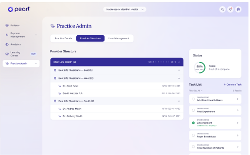
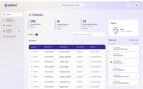
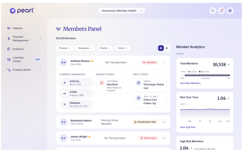
The core design challenge was addressing providers' two biggest blockers—lack of analytics and limited bandwidth—while building enough trust and clarity that time-strapped physicians would actually act. Value-based care programs carry real financial risk, and providers needed to feel confident before committing. That meant designing a platform that could do three things at once: reduce cognitive load, increase financial legibility, and make value-based care feel understandable, transparent, and actionable.
Outcomes

Raised $75M Series B funding

60% reduction in time to identification at-risk patients

4.8/5 User satisfaction score
BACK

All work designed with love (and many sticky notes) by © Bridget Lyons, Studio b Creative Co. LLC 2026. All rights reserved.

About

Resume

Good morning, Dr. Patel

Your practice, at a glance.

Jump back into where you left off, or explore a new area of the platform.

Patients

250 aligned · 14 unaligned

Payment Management

Sep payment · $6,144

Task List

5

1 of 5 complete

Analytics

$150k savings forecast

Learning Center

New

3 new items

Practice Admin

Provider & user setup

© 2026 Pearl Health

Terms of Service

Privacy Policy

Hackensack Meridian Health

Full case study ~8 min read

B2B

Health Tech

Web App

Reducing patient risk identification time by 60% for primary care providers

Designed and launched MVP for a new health tech platform, defining core UX, care journeys, and product architecture from the ground up.

Link to Prototype

Year2025

Fill-Time

6 months

Methodologies

User Centered DesignUser FlowsUX & UI DesignPrototyping

Requirements Gathering & ValidationUsability Testing & Card SortingUX Writing

Tools & Frameworks

Loveable: Vibe CodeJira & Confluence

Google Slides

Context

Pearl Health is a technology platform that supports primary care practices in value-based care programs, helping clinicians identify and surface high-risk patients, coordinate care more effectively, and improve health outcomes.

I led the 0→1 design and launch of an MVP dashboard, defining core product structure and translating complex healthcare data into clear, actionable experiences.

Role: Lead UX Designer

Scope: I led the design of the MVP from early requirements through to launch, working closely with primary care physicians to define and validate core workflows. Throughout the process, we translated initial product requirements into functional design concepts, continuously testing and refining the platform based on physician feedback and usability insights to ensure it supported real-world clinical needs.

Problem

Primary care physicians play a critical role in improving patient outcomes and reducing healthcare costs, particularly within value-based care models. However, those participating in Direct Contracting lacked a clear, trustworthy way to understand their patient populations or track financial and clinical performance. Existing tools surfaced large volumes of fragmented and often unreliable data without prioritization or context, forcing providers to spend valuable time searching for critical insights instead of focusing on patient care.

This gap left physicians operating reactively rather than proactively, limiting their ability to identify high-risk patients, coordinate care effectively, and fully realize the benefits of value-based care—both for patient outcomes and practice revenue.

Pearl Health was founded to address this challenge by empowering primary care providers with the tools and insights needed to deliver better care and succeed under value-based payment models.

Key pain points:

Every single participant had to rely on Medicare directly just to view their own patient lists—there was no consolidated view

Difficult to identify which patients need immediate attention—high risk patients

EHRs were missing critical Medicare payment details, creating friction in an already complex workflow

Most weren't familiar with capitation payments and were making decisions on blind assumptions

Opportunity

The team believed that earlier onboarding would prepare providers for Direct Contracting before their patient data was even available—essentially, build readiness during the waiting period. That's the "why now" for the whole product.

The Desired Emotional Outcomes (great for framing the problem) For administrators: "I'm ready, I'm prepared. Things are easier using Pearl Health." For physicians: "Pearl will tell me what I need to know. When I use Pearl, my life gets better." These are worth including because they show the team was designing toward emotional trust, not just utility.

1

Smart prioritization

Implemented an intelligent risk scoring system that automatically surfaces patients requiring immediate attention, with clear visual indicators and explanations for each risk factor.

2

Streamlined navigation

Design the IA to reduce clicks and cognitive load, creating clear pathways for the most common tasks and workflows.

3

Data visualization

Use intuitive charts and graphs that make complex healthcare data easy to understand at a glance, with the ability to drill down for more details when needed.

4

Mobile-first design

Build a responsive interface that works seamlessly on tablets and phones, enabling providers to access critical information between patient visits.

Goals

    • Increase financial transparency into value-based care opportunities for primary care practices
    • Simplify understanding of participation options in programs
    • Reduce complexity in evaluating the financial implications of different care models
    • Help providers navigate limited time, bandwidth, and resources when assessing options
    • Enable more informed decision-making around adopting value-based care programs

Key Features

    • A dashboard that gives providers a clear view of their patient population at a glance
    • Tools that surface which patients need the most urgent attention
    • Clear visibility into how clinical work connects to financial performance
    • Deeper patient views for understanding context and next steps
    • A workflow built around how providers actually make decisions day to day
    • A way to go from raw data to clear, actionable next steps quickly
    • Designed to make value-based care easier to understand and act on

Research

What I DidI conducted 2 rounds of recorded moderated usability testing were conducted across a 4-month period (July–October 2021) in partnership with Pearl Health. Each round used a think-aloud protocol, asking participants to verbalize their reactions, thoughts, and opinions as they navigated key screens and completed defined tasks. Round 1 also incorporated a card sorting exercise to establish feature priority.Who I Did It With

Round 1 included 5 participants across 4 practices. Round 2 included 5 participants across 3 practices. Both rounds intentionally recruited a mix of small single-physician practices and larger multi-location medical conglomerates, including practices currently dissatisfied with existing tools and those with no solution at all. Roles represented included Practice Managers, Administrators, Physician Directors, Finance Administrators, and Data Analytics Managers.

What I MeasuredThe core goals across both rounds were to validate the MVP feature set, identify usability friction and areas of confusion, confirm discoverability of core functionality, assess the domain knowledge required to use the application, and gauge user trust and likelihood to adopt.

Key Findings

  • Navigation defaults to the menu, not the guide. Every participant abandoned the coach mark onboarding and navigated independently through the left-side menu—a unanimous signal that guided tooltips weren't earning attention or trust.

  • Registration requires outside help. All participants identified that completing registration would require pulling information from another system or another person entirely. Medicare payment IDs and related details are rarely surfaced in EHRs, creating a frustrating dead end during a critical first-use moment.

  • Insights are valued—but not obviously interactive. Participants responded enthusiastically to the actionable insights feature, yet none recognized the analytics sliders as interactive on first glance. The value was there; the affordance wasn't communicating it.

  • The Partners page is invisible. Not a single participant found their way to the Partners section when prompted. Without a recognizable label or clear entry point, the feature effectively didn't exist in the user's mental model.

  • Tasks resonate; audio is a bonus. 3 out of 5 participants found the tasks feature genuinely useful for managing their workload. Two out of five lit up at the idea of listening to audio recordings during their commute—a small but telling signal about how and when this audience consumes information.

  • Analytics are dense for non-clinical roles. Practice Managers found the analytics data highly valuable but struggled to scan it due to heavy acronym use. The information is right—the presentation needs to meet non-clinical users where they are.

  • Users want community-style benchmarking. Practice Managers weren't just looking for their own data—they wanted to know how they were performing relative to peers. A community or benchmarking layer would directly address this need and increase platform stickiness.

GuidingPrincipals

TransparentProvide visibility into other practice success and struggles AND provide visibility into other locations within their practice

HelpfulActions telling users how they can save and be successful

FlexibleAllow users to select their own settings and permissions; ie display insights in % vs dollar amounts

SimpleKeep actions and the UI simple

Goal Oriented

Add goal oriented opportunities in analytics and refine that section

Solution

The core design challenge was addressing providers' two biggest blockers—lack of analytics and limited bandwidth—while building enough trust and clarity that time-strapped physicians would actually act. Value-based care programs carry real financial risk, and providers needed to feel confident before committing. That meant designing a platform that could do three things at once: reduce cognitive load, increase financial legibility, and make value-based care feel understandable, transparent, and actionable.

Outcomes

Raised $75M Series B funding

60% reduction in time to identification at-risk patients

4.8/5 User satisfaction score

BACK

All work designed with love (and many sticky notes) by © Bridget Lyons, Studio b Creative Co. LLC 2026. All rights reserved.

About

Resume