
Mini-Circuits eCommerce Responsive Website
Reimagining how engineers purchase products through an intelligent, modern experience. While elevating the Mini-Circuits brand
Using systems thinking to simplify complex products.


Overview
TBD

2020 – 2021
Company Type
Established Retail Company
Role
Senior UX Designer, Lightmatter
Platform
Web App
Design and Research Timeline
3 Months
Team
Davis Rothenberg, Marketing Manager
Stacey Lee Weitz, UX Designer
Stephanie Adams, Project Manager
Jake Kent, Engineering Lead

Problem
MC’s eCommerce experience was out of date. An antiquated checkout, user experience to the backend architecture. Users struggled to find products and would call customer service to make a purchase.

Solution
We designed a new modern eCommerce experience that allows users to easily purchase products easily, serve intelligent companion products. While elevating the Mini-Circuits brand.

Discovery
We had 2 weeks to understand their business and marketing goals, product vision, and user problems and needs. We knew we couldn’t capture everything in 2 weeks, therefore our discovery and requirements definition continued throughout our process.
Initial Planning Phases
• Understand who Mini-Circuits is and their product offering
• Gather a list of key client stakeholders and understanding there org structure
• Review the SOW and any relevant documentation provided by the client
• Review any and all qualitative and quantitative data and requirements; 2 comprehensive decks worth of data and information
• After identifying what questions needed to be answered,
we crafted a series of workshops that we believe would help us answer those questions and fill in any gaps
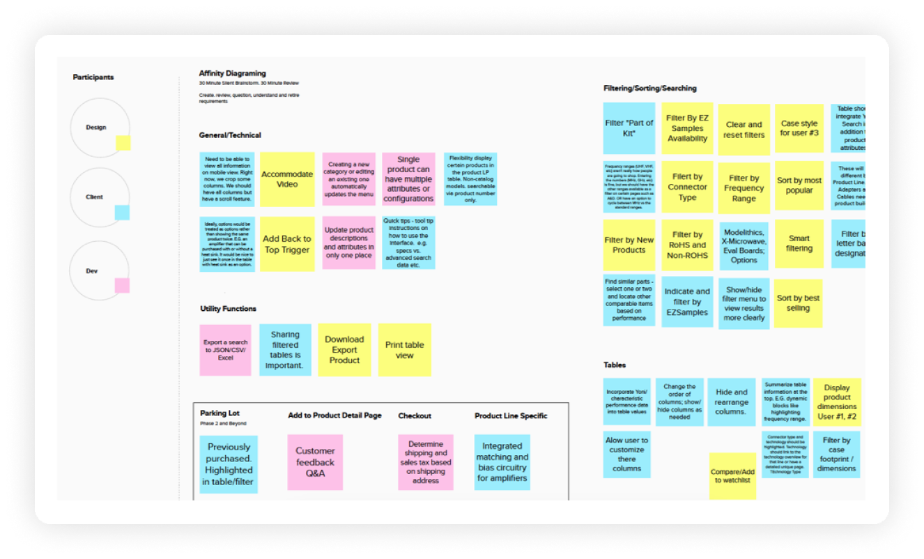
Methodologies
• Lean UX Canvas
• Product and filter taxonomy workshop
• ID and prioritize personas, and create several lean persona with workflows
• Stakeholder interviews
• Requirements gathering and prioritization
• Cognitive walkthrough


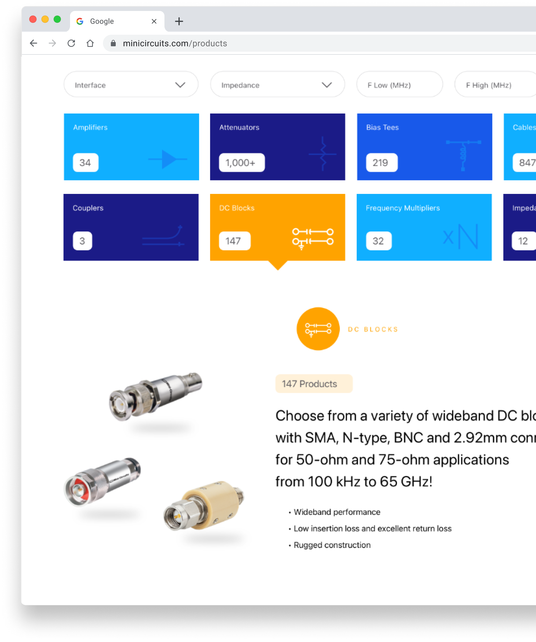
Product discoverability, exploration and comparison
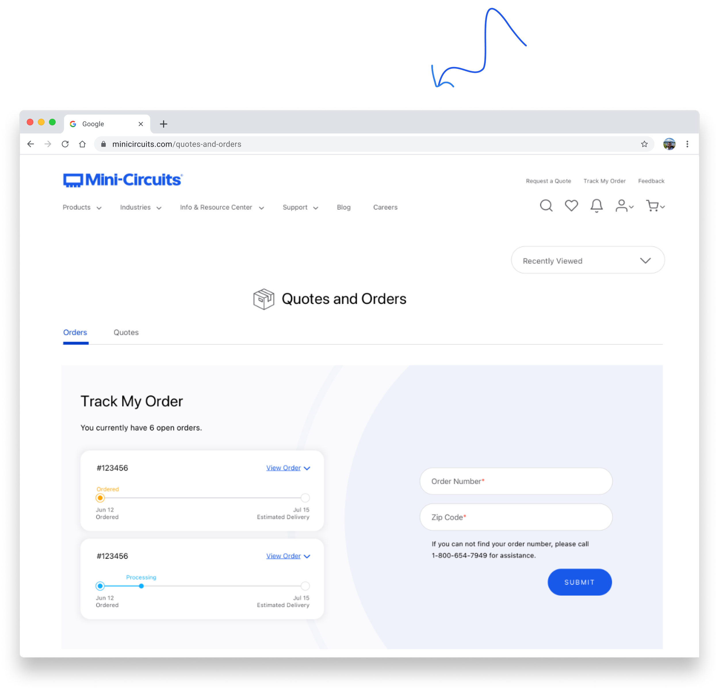
Improved checkout
Ordering and billing transparency
Self-sufficiency

User Goals
Modern platform; UX, UI and Tech
Increase online ordering
Marketing Integrations

Business Goals

Deliverables
• Meaningful roadmap with design sprints
• 3 hypothesis
• 3 primary metrics: self-sufficiency, efficiency & satisfaction rates
Sufficiency
Users will be more proactive and self-sufficient with improved product detail pages that help users easily validate and compare products simplifying the complexity of the data, therefore increasing online orders.
Efficiency
Users will save time and money with visibility into order status and management through the implementation of a persona based dashboard.
Satisfaction Rates
User satisfaction rates will increase by generating automatic order communications and documentation throughout the discovering, ordering and billing process.


Hypothesis (3)
Improved Navigation
Create Product Search
Basic and Advanced Product Filtering
Indirect ERP Improvements
Product Watchlist

Opportunities

Learnings


Design
Once we worked through the website architecture we began mapping out a template strategy and modular approach for efficiency and reuse.
In parallel we began building a design system made up
of modules, components — while wireframing the experience for both desktop and smartphone views. After initial approval of the wireframes, we went on to design high-fidelity mock-ups of just the desktop version in order to meet our 6 month deadline. InVision prototypes were created in order to get final buy-in
from our client stakeholders.

Our research and workshops continued and we iterated as needed. While we pitched the idea of validating the designs through usability tests with end users, the client declined due to the time line and we utilized Mini-Circuits engineers (not software engineers, hardware engineers) to validate and iterate on the design.


Deliverables
• Sitemap
• InVision prototype
• Persona based content strategy
• Detailed functional and behavioral specs
• Filter logic for 27 product lines
• Scalable data analytics strategy
• Detailed design system w/Module matrix
• Wireframes
• Constant communication is imperative
• It’s not a typical grooming or hand-off process
• Be flexible, pivot early & often
• We could improve the experience if we automated the communication of the ordering and billing process. Currently there was no visibility into your order unless you called your support rep directly
• Users wanted more self-service online, but the website needed to be more sophisticated to support
there changing needs
Learnings
Decreased Support Calls
Increased Online Ordering
Improved Satisfaction Rates

Metrics
Overview
Users no longer needed to call customer support to find and order products. They had a modern, simply experience with improved filter functionality tailored to them and not limited by it’s technology. They were able to explore, save and compare complex products with detailed product pages and an enhanced, yet familiar checkout experience. Therefore, increasing online orders. And, as a direct results minimizing customer support call volume — saving the business time and money.

Working Smarter


Bridget is a very talented designer. She was very thorough, incorporating UX solutions for all of the user stories and flows. Bridget also took our existing style guide and elevated it.

Davis Rothenberg
Marketing & Branding Specialist
Mini-Circuits